Rebrand.
Anderton Gables.
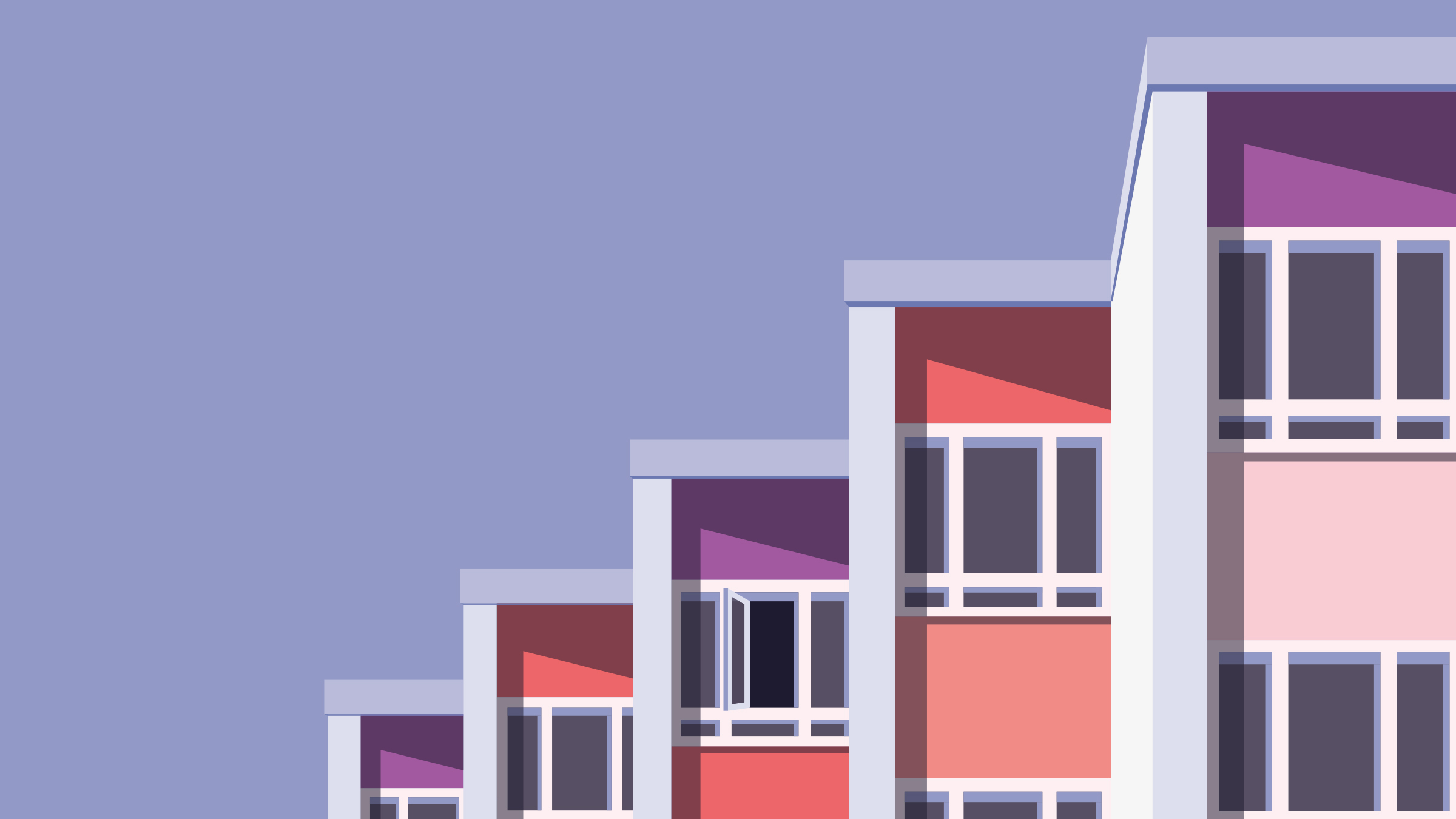
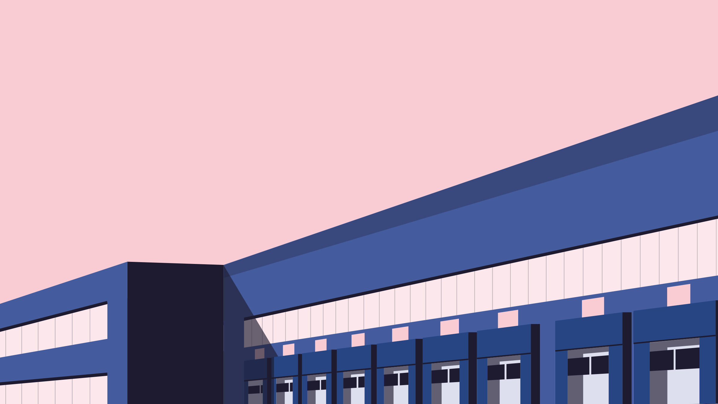
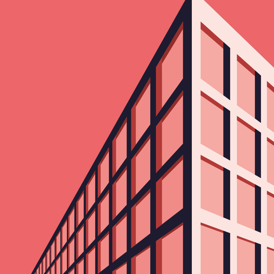
The property and construction industries tended to have a ‘look’. Lots of greys and dark blues – be it websites, brochures, or suit choices. AG wanted something different to fit their 'straightforward', 'down-to-earth' way of working as their existing brand assets didn't do the trick.

Delivery
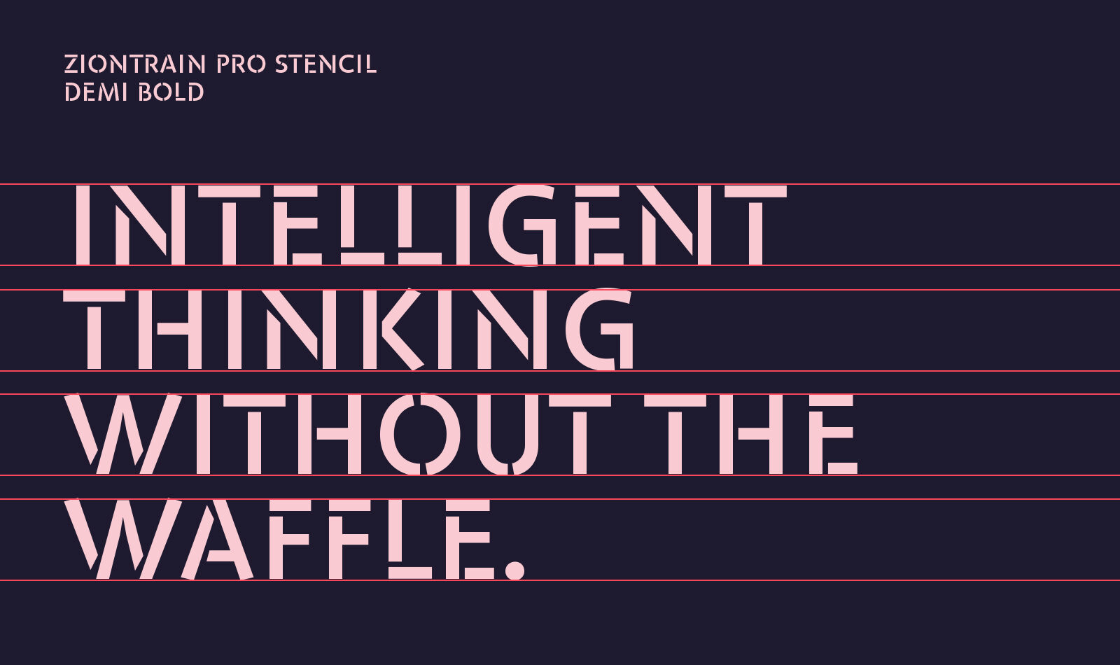
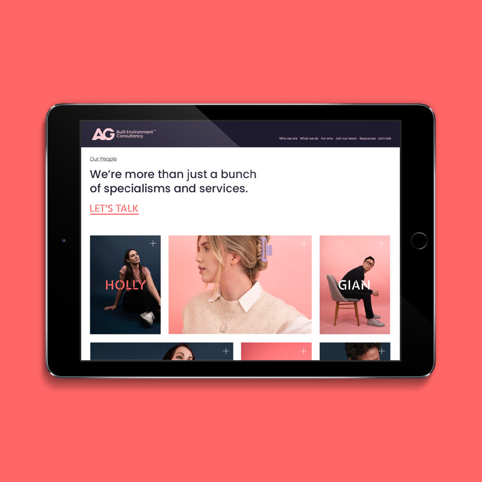
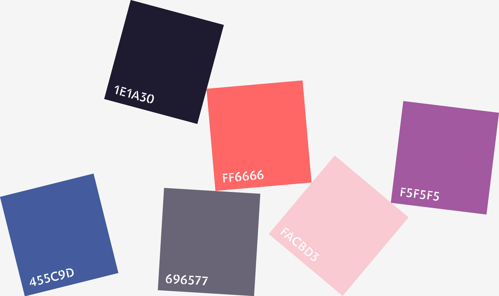
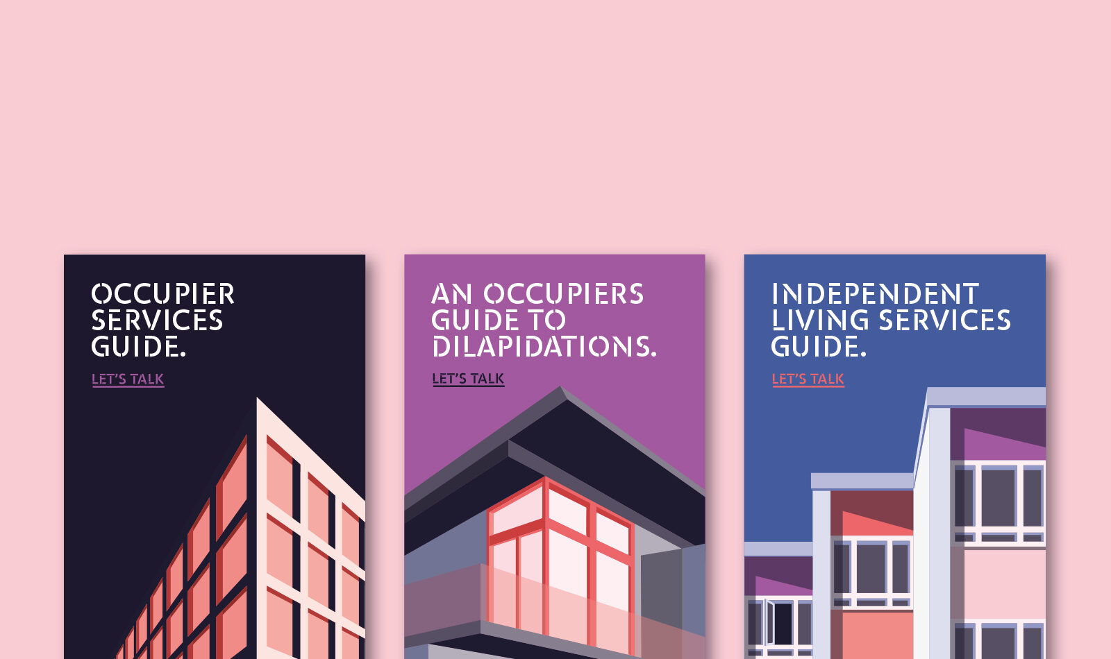
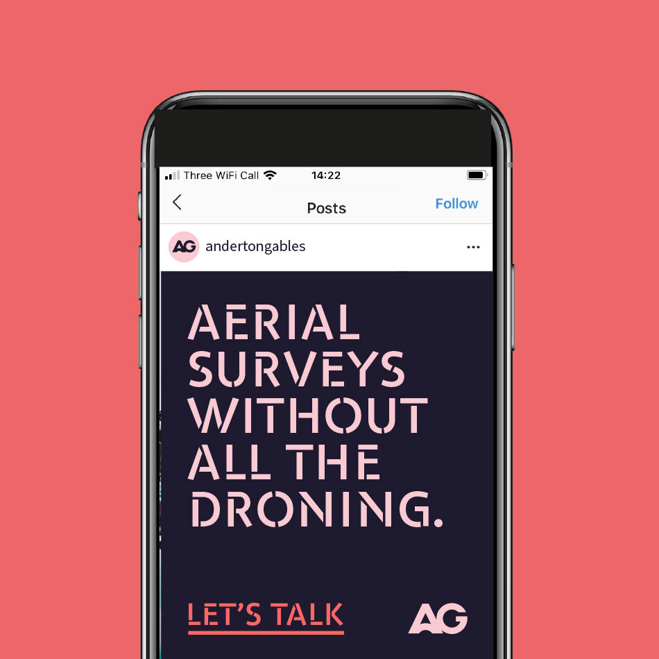
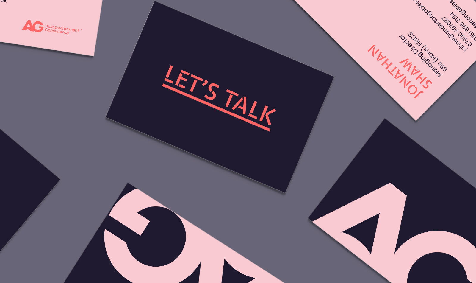
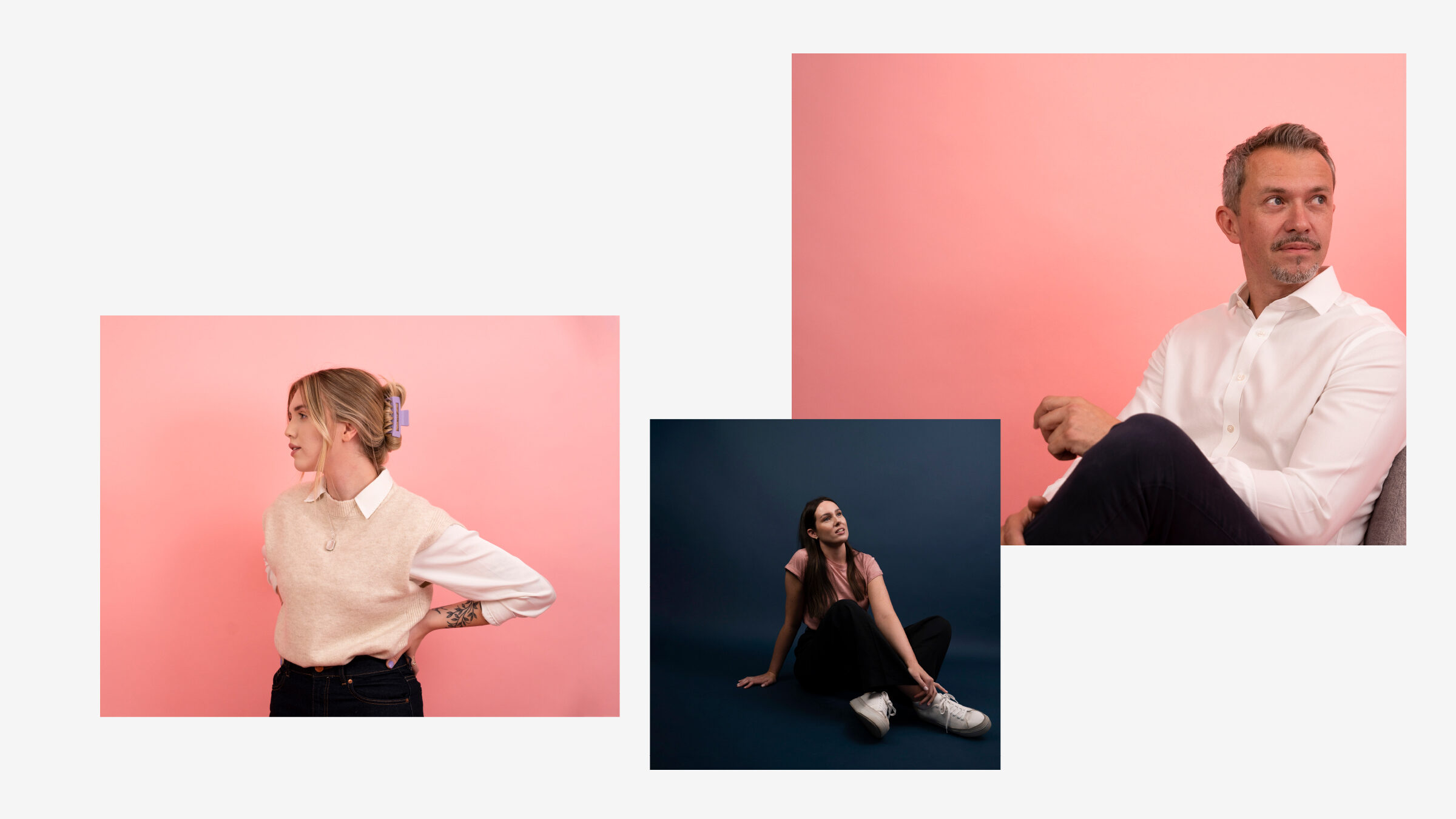
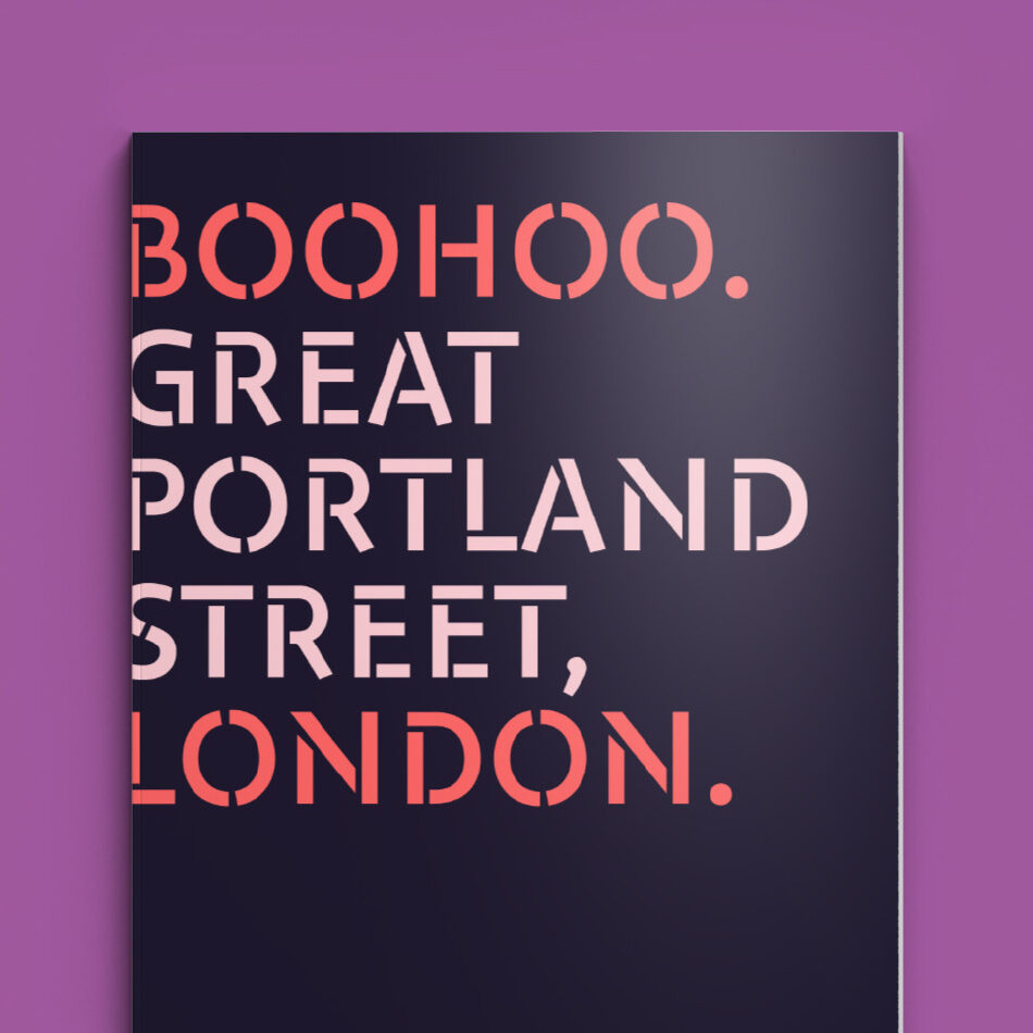
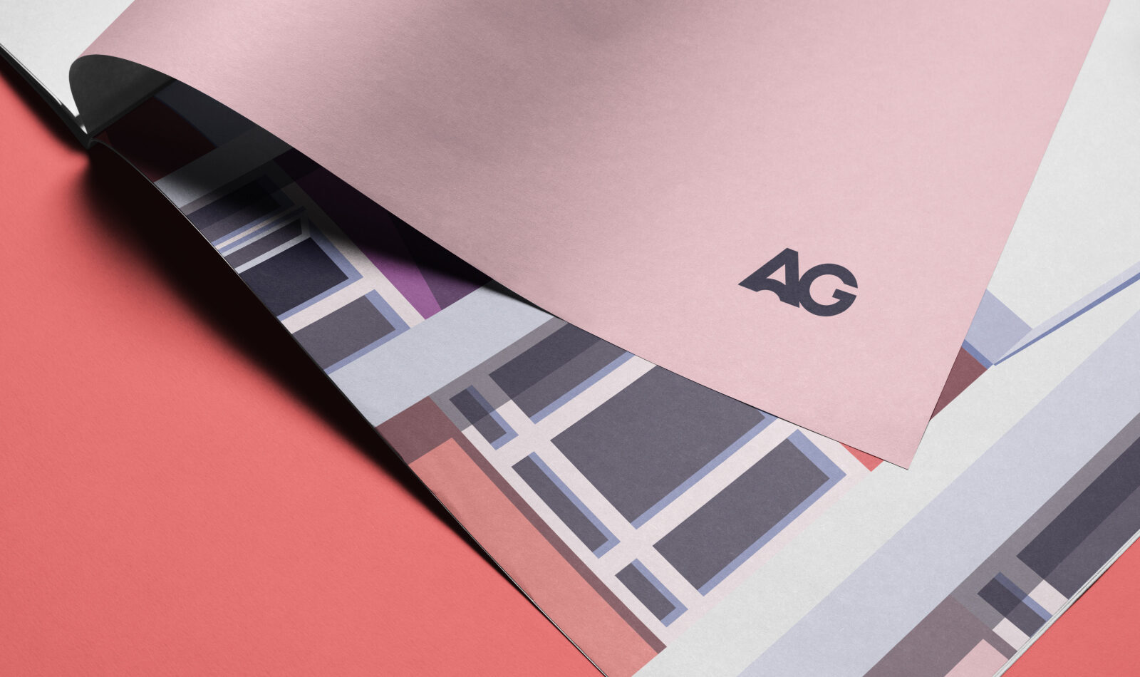
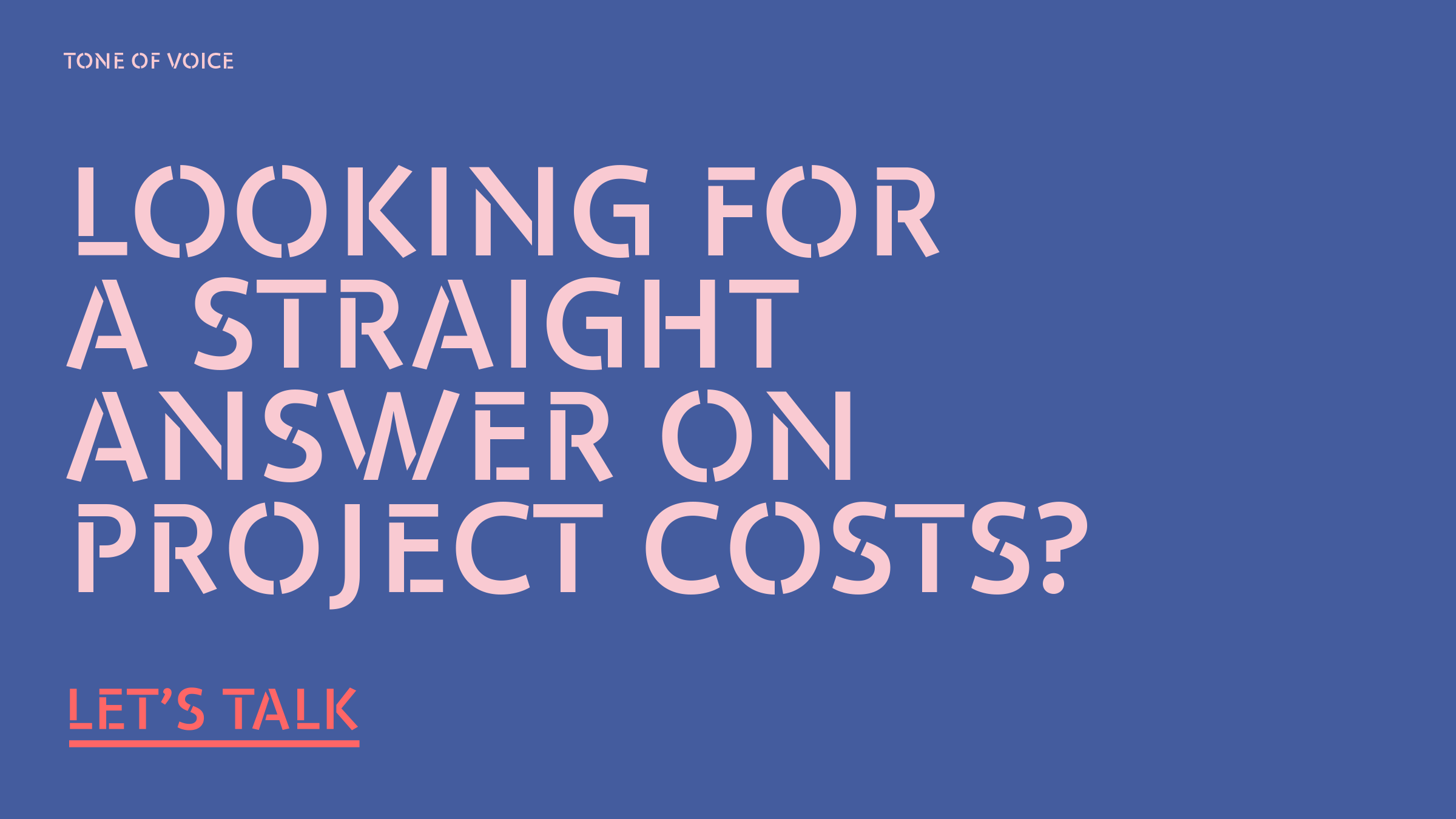
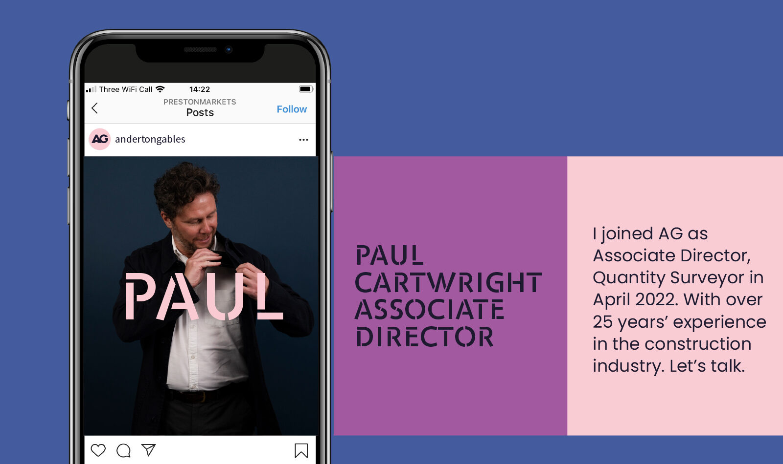
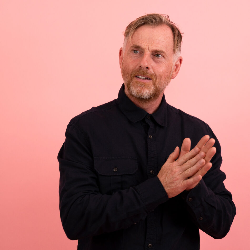
A refreshed look that made them stand out from the crowd, with an injection of personality and bold, own-able colour palette within their sector. We tweaked their mark, developed a toolkit of visual assets, bespoke illustrations and stylised team photography to kickstart their new chapter.
Services
+ Creative Concept + Brand Voice + Photography
+ Illustration + Asset Creation + Brand Guidelines
+ Art Direction

With Thanks.
Our Extended Team.
Rachel Ovenden - Photography
Gabrielle Street - Illustration
Bob Murison - Copywriting